9 Reduce dimensionality - UMAPs
There are a few steps of number-crunching before we get to generating a nice UMAP representation of our data.
Why are these steps needed?
- Normalisation Different cells have different total target counts. Normalisation allows them to be comparable.
-
Identification of highly variable features (feature selection) Identifying the most variable features allows retaining the real biological variability of the data and reduce noise in the data.
- Scaling the data: Highly expresed genes can overpower the signal of other less expresed genes with equal importance. Within the same cell the assumption is that the underlying RNA content is constant. A
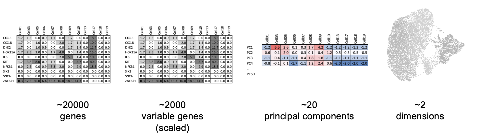
- Dimensionality reduction (PCA): Imagine each gene represents a dimension - or an axis on a plot. We could plot the expression of two genes with a simple scatterplot. But a genome or gene panel has 100s to 1000s of genes - how do you collate all the information from each of those genes in a way that allows you to visualise it in a 2 dimensional image. This is where dimensionality reduction comes in, we calculate meta-features that contains combinations of the variation of different genes. From hundreds of genes, we end up with 10s of meta-features
- Run non-linear dimensional reduction (UMAP): Finally, make the UMAP plot that arranges our cells in a logical and eazy to visualise way. Note the tSNE algorithm (which makes tSNE plots) is an older alternative method to UMAP.
9.1 Normalisation
Start by ‘splitting’ the object so that each sample has its own assay again.
# Basic preprocessing
# Split layers out again
# https://satijalab.org/seurat/articles/seurat5_integration
so <- split(so, f = so$orig.ident)
By default, we will use the ‘LogNormalize’ method in seurat - as described in the NormaliseData function help:
- “LogNormalize: Feature counts for each cell are divided by the total counts for that cell and multiplied by the scale.factor. This is then natural-log transformed using log1’”
INFO: For a more indepth discussion of normalisation in spatial datasetsw see Atta et al (2024) https://genomebiology.biomedcentral.com/articles/10.1186/s13059-024-03303-w and be aware of spatial-aware methods such as SpaNorm (https://genomebiology.biomedcentral.com/articles/10.1186/s13059-025-03565-y)
so <- NormalizeData(so)9.2 Find Highly variable genes.
Which genes vary between cell types/states in our sample?
We don’t yet know anything about celltypes or stats, but we can make the assumption that the genes with high variance anre probably reflecting some biological state. In contrast a ‘housekeeper’ gene with even expression across all cell types won’t be helpful in grouping our cells.
Because we have our data split by sample, seurat will identify variable genes within each sample and combine that information. From the seurat5 documentation on layers: “Note that since the data is split into layers, normalization and variable feature identification is performed for each batch independently (a consensus set of variable features is automatically identified).”
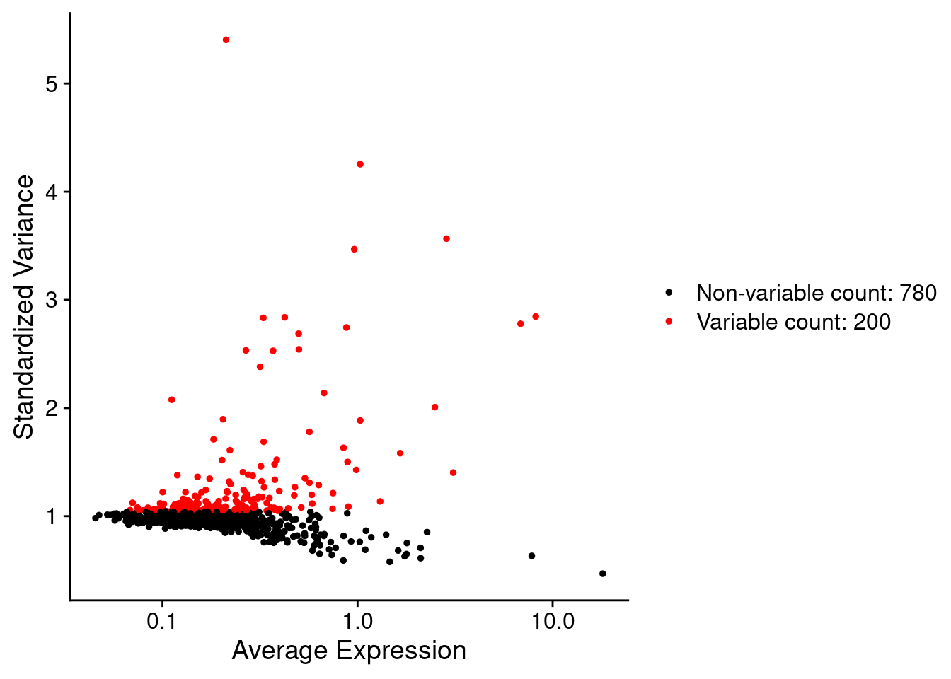
so <- FindVariableFeatures(so, nfeatures = 200)Each point represents one gene - the red ones are our top 200 ‘highly variable genes’ or HVGs. There is no firm rule on how many HVGs we want. For a whole transcriptome that could be 2000, for a 1000 genel we have 200. The exact number doesn’t matter so much, we want to capture the genes above the main group of low variance genes.
We can list those genes:
head(VariableFeatures(so))## [1] "IGHG1" "IGHM" "TPSB2" "IGHG2" "JCHAIN" "TPSAB1"9.3 Scale data
By default, the scaleData function will scale only the HVGs.
so <- ScaleData(so) # Just 200 variable featuresNote the presence of the single ‘scale.data’ layer.
so## An object of class Seurat
## 999 features across 50662 samples within 2 assays
## Active assay: RNA (980 features, 200 variable features)
## 13 layers present: counts.GSM7473682_HC_a, counts.GSM7473683_HC_b, counts.GSM7473684_HC_c, counts.GSM7473688_CD_a, counts.GSM7473689_CD_b, counts.GSM7473690_CD_c, data.GSM7473682_HC_a, data.GSM7473683_HC_b, data.GSM7473684_HC_c, data.GSM7473688_CD_a, data.GSM7473689_CD_b, data.GSM7473690_CD_c, scale.data
## 1 other assay present: negprobes
## 6 spatial fields of view present: GSM7473682_HC_a GSM7473683_HC_b GSM7473684_HC_c GSM7473688_CD_a GSM7473689_CD_b GSM7473690_CD_c9.4 PCA
Now to run a PCA (Principal Component Analysis).
so <- RunPCA(so, features = VariableFeatures(so))Now there is a ‘pca’ reduction listed in the object.
so## An object of class Seurat
## 999 features across 50662 samples within 2 assays
## Active assay: RNA (980 features, 200 variable features)
## 13 layers present: counts.GSM7473682_HC_a, counts.GSM7473683_HC_b, counts.GSM7473684_HC_c, counts.GSM7473688_CD_a, counts.GSM7473689_CD_b, counts.GSM7473690_CD_c, data.GSM7473682_HC_a, data.GSM7473683_HC_b, data.GSM7473684_HC_c, data.GSM7473688_CD_a, data.GSM7473689_CD_b, data.GSM7473690_CD_c, scale.data
## 1 other assay present: negprobes
## 1 dimensional reduction calculated: pca
## 6 spatial fields of view present: GSM7473682_HC_a GSM7473683_HC_b GSM7473684_HC_c GSM7473688_CD_a GSM7473689_CD_b GSM7473690_CD_cBy digging into the seurat object, just to have a look, we can see there is a value for each PC (Principal Compenent) for each cell.
so@reductions$pca@cell.embeddings[1:10,1:5]## PC_1 PC_2 PC_3 PC_4 PC_5
## HC_a_1_1 6.217419 -1.8061005 -0.25805262 0.61965670 -2.562506
## HC_a_2_1 7.650406 -4.9282210 2.56525240 1.33029222 -4.631155
## HC_a_3_1 5.524381 0.6807641 0.46285057 -1.26006689 -4.810636
## HC_a_4_1 3.798449 1.8721929 0.10183529 -0.06891715 -3.358003
## HC_a_5_1 6.690936 -3.8183472 0.17136972 1.03536202 -4.176235
## HC_a_6_1 6.193700 -5.9931664 2.46855416 0.25142038 -3.261390
## HC_a_7_1 5.531542 -2.0889510 0.72048496 1.22893547 -3.697925
## HC_a_8_1 6.869279 -4.0229095 0.15006296 2.51955461 -2.704131
## HC_a_9_1 6.880725 -2.3290435 0.86859571 0.26676695 -4.046725
## HC_a_10_1 6.177942 -2.8228681 0.08023504 2.98939960 -5.696438In some contexts (e.g. Bulk RNAseq experiemnts), PCs can be enough to group and explore the difference betwen samples. e.g. See [this plot in some DEseq2 documentation] (https://bioconductor.org/packages/devel/bioc/vignettes/DESeq2/inst/doc/DESeq2.html#principal-component-plot-of-the-samples).
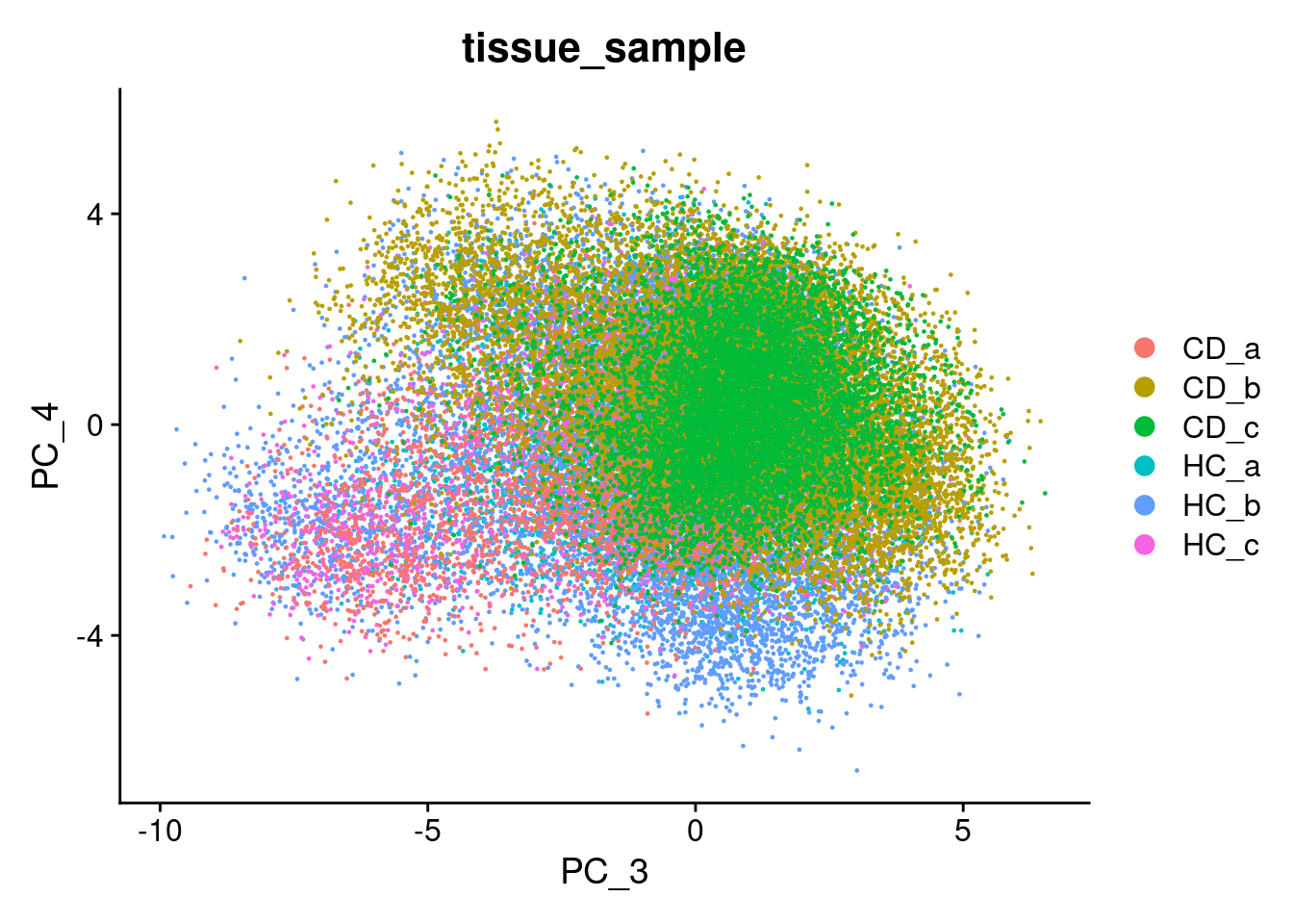
We can try that here, but because of the sheer number of cells and the diversity among them, it rarely works in spatial or single cell datasets - simply a blob.
Plot PC1 vs PC2, and PC3 vs PC4.
DimPlot(so, reduction = "pca", group.by='tissue_sample')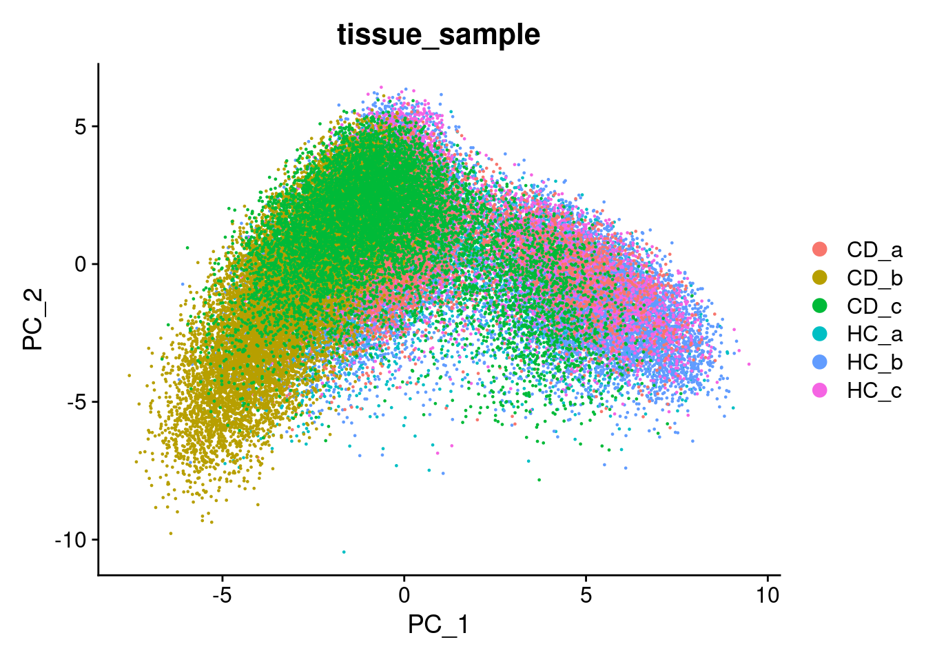
9.5 UMAP
UMAP (Uniform Manifold Approximation and Projection) is a method for summarising multiple principal components into fewer dimensions for vizualisation - generally just x and y.
UMAP is:
- Non-linear: Distances between cells in PCA are linear, wheras those in UMAP are non-linear. Ie. A larger distance between two cells does not neccessarily mean a greater transcriptional difference.
- Non-deterministic: The same data could produce a different layout, though generally the functions use set random numbers avoid this. Even so - removeing just one cell will shuffle the result, and it is a nearly impossible task to reproduce an existing UMAP! General trends should remain stable.
If you are interested in exploring how UMAP works futher, this Understanding UMAP page is an excellent interactive resource.
To build a UMAP we need to decide how many principal components we want to summarise. An ‘elbow plot’ shows the proportion of variance that is explained by each PC - starting from PC1 - which alwasy explains the most. Eventually the variance explained drops off to a base level - extra PCs aren’t adding much there.
A general rule of thumb is to pick where the standard variantion levels out in the plot below - the ‘elbow’. There is no harm in rounding up. Typically this is between 10-20, and is higher for more complex datasets.
Here we choose 15.
ElbowPlot(so)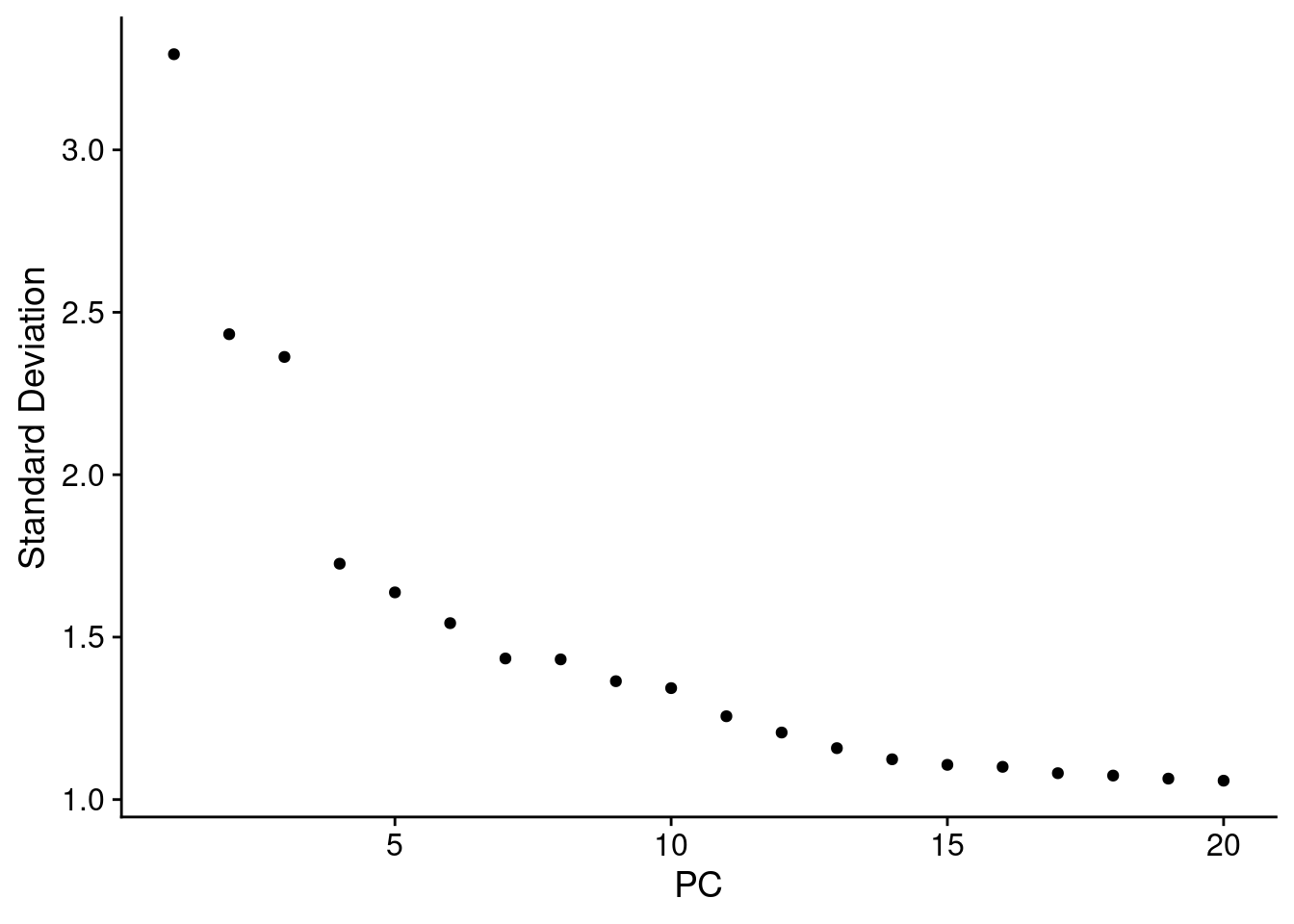
Then build a UMAP with the first 15 PCs.
num_dims <- 15
so <- RunUMAP(so, dims=1:num_dims)
## Warning: The default method for RunUMAP has changed from calling Python UMAP via reticulate to the R-native UWOT using the cosine metric
## To use Python UMAP via reticulate, set umap.method to 'umap-learn' and metric to 'correlation'
## This message will be shown once per sessionAnd plot it - Here coloured by the tissue sample.
# you can specify reduction='umap' explicity
# DimPlot(so, group.by='tissue_sample', reduction = 'umap')
# But by default, if a umap exists in the object, Dimplot will plot it.
DimPlot(so, group.by='tissue_sample') 
9.6 Using UMAP to visualise your data
Now is the time to plot any interesting looking metadata on your UMAP.
- QC : Slide, total RNA, negative probes, slide, batch
- Experimental: Groups, samples, timepoint, treatment, mouse
We want to identify trends and biases that could be technical or experimentally interesting.
View categorical factors with ‘DimPlot’, and continuous onces with ‘FeaturePlot’. The split.by parameter is quite useful to separate out certain variables, like experimental group.
There is a little separation by condition - but it appears that it could be due to the individual (we’ll adress this next).
DimPlot(so, group.by='tissue_sample')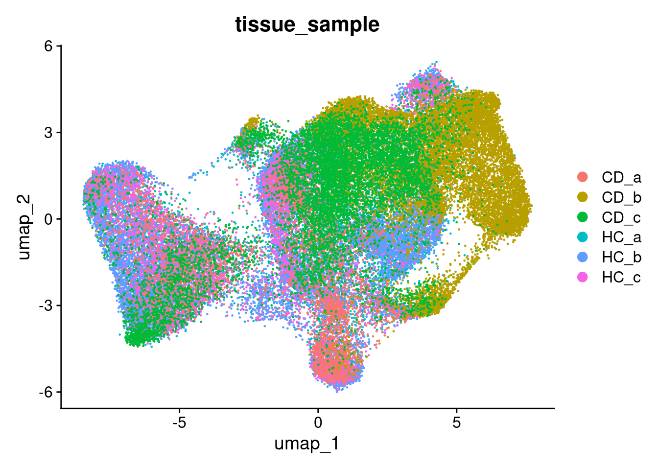
DimPlot(so, group.by='condition')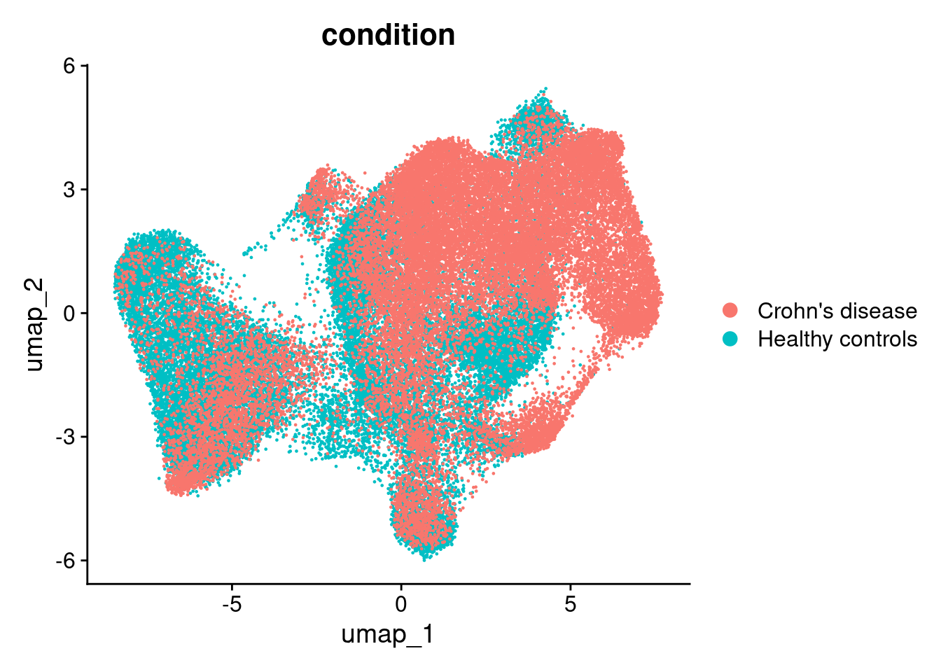
DimPlot(so, group.by='tissue_sample', split.by='condition')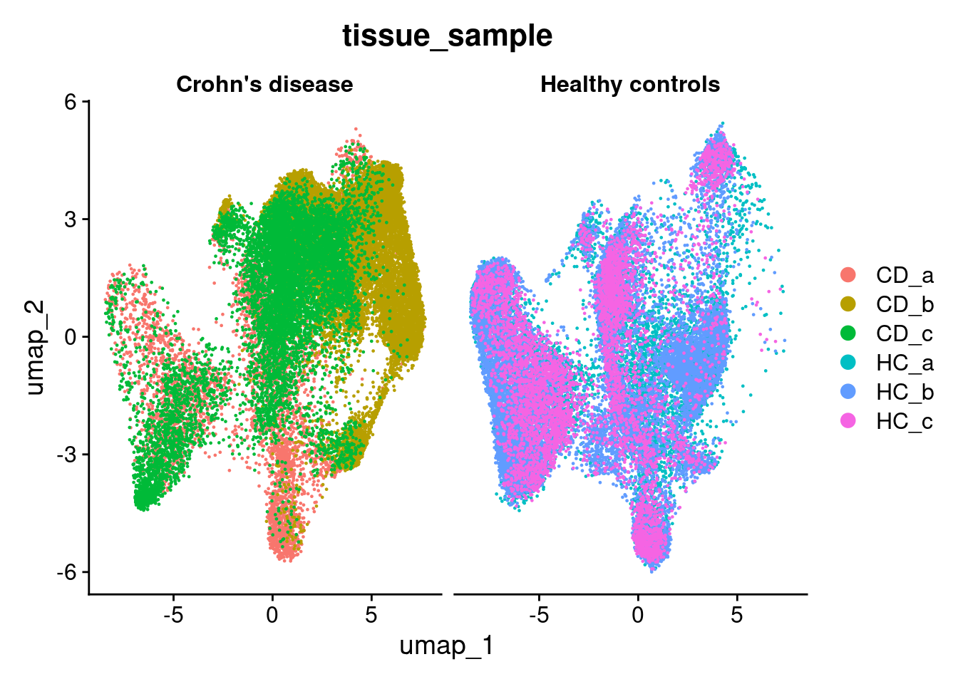
Here we can see that the negative probe counts line up with our total counts. And that higher counts are concentrated in certain regions of the UMAP.
FeaturePlot(so, 'nCount_RNA') 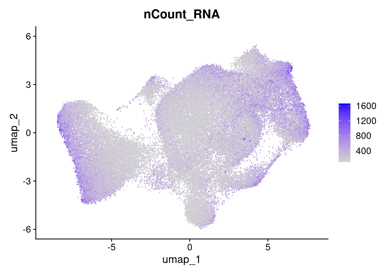
FeaturePlot(so, 'nCount_negprobes') 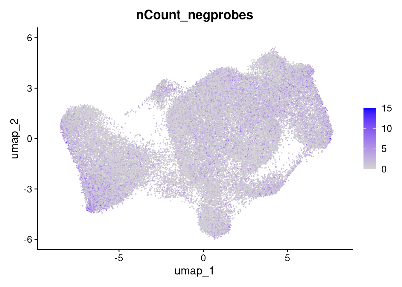
But the overall % of negative probes is more random.
FeaturePlot(so, 'pc_neg') 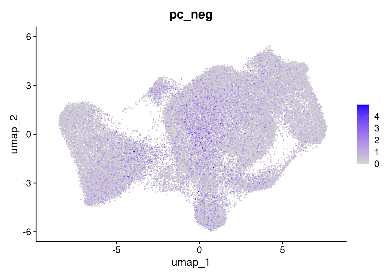
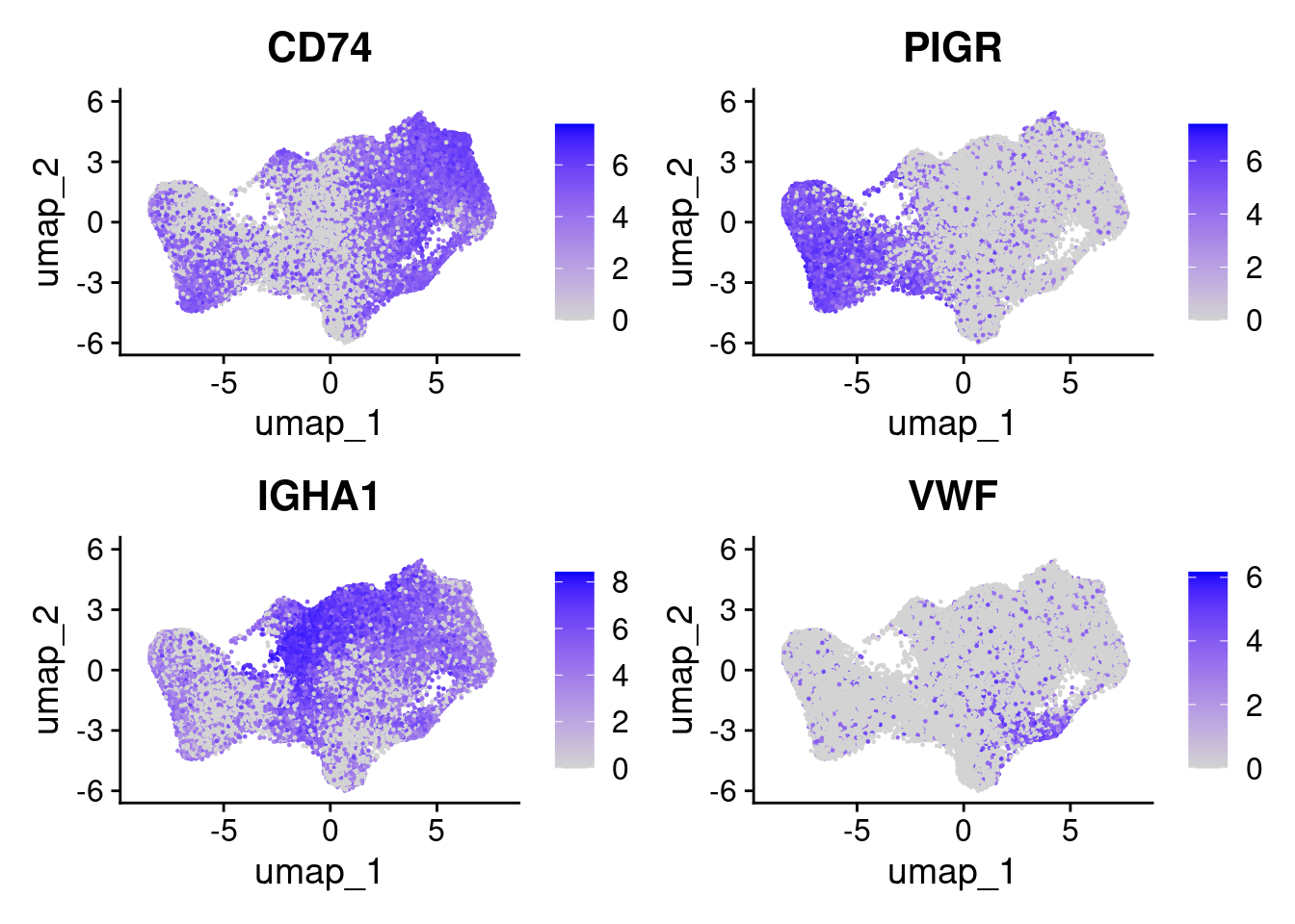
Likewise, it can also be helpful to plot a few genes at this point. We can provide a list.
FeaturePlot(so, c('CD74','PIGR','IGHA1','VWF'), ncol=2 )